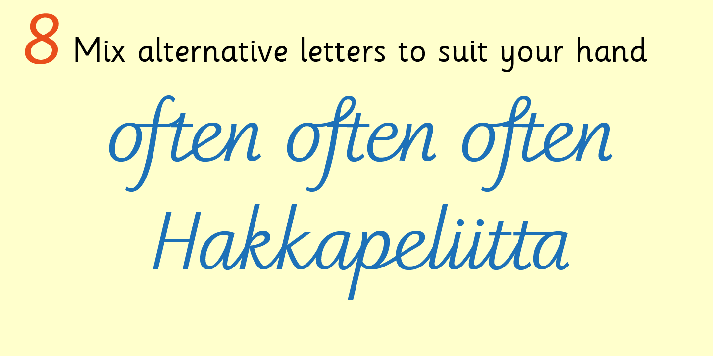

When used at large sizes the friendliness of Sassoon types really shines. Sassoon Primary Medium Condensed is a compact style for headlines combining the right amount of weight, yet in a friendly style. These typefaces have built-in letter spacing because of their exit strokes, as well as extra clarity designed into them. It also appeared that the poorer readers profited from wider word spacing, while spacing that suited the poorest readers, positively annoyed the better readers. In the research undertaken with young readers the importance of consistent spacing was clear. Justification should be used only when absolutely necessary. Don’t forget that justifying short lines disrupts spacing.

When laying out pages for young readers, particular care should be taken over word spacing.

Those who design books for young children should consider the different needs of their readers.


 0 kommentar(er)
